Friday 9 December 2011

The registration is dead, long live The Registration

I have just finished the third in my Chough series, in which I experimented a little bit with cutting a sun in the evening sky. I think this is the first time I have actually depicted the sun in a composition by cutting it in to the colour rather than perhaps just smearing a bit of the ink away to suggest a highlight area of the sky.

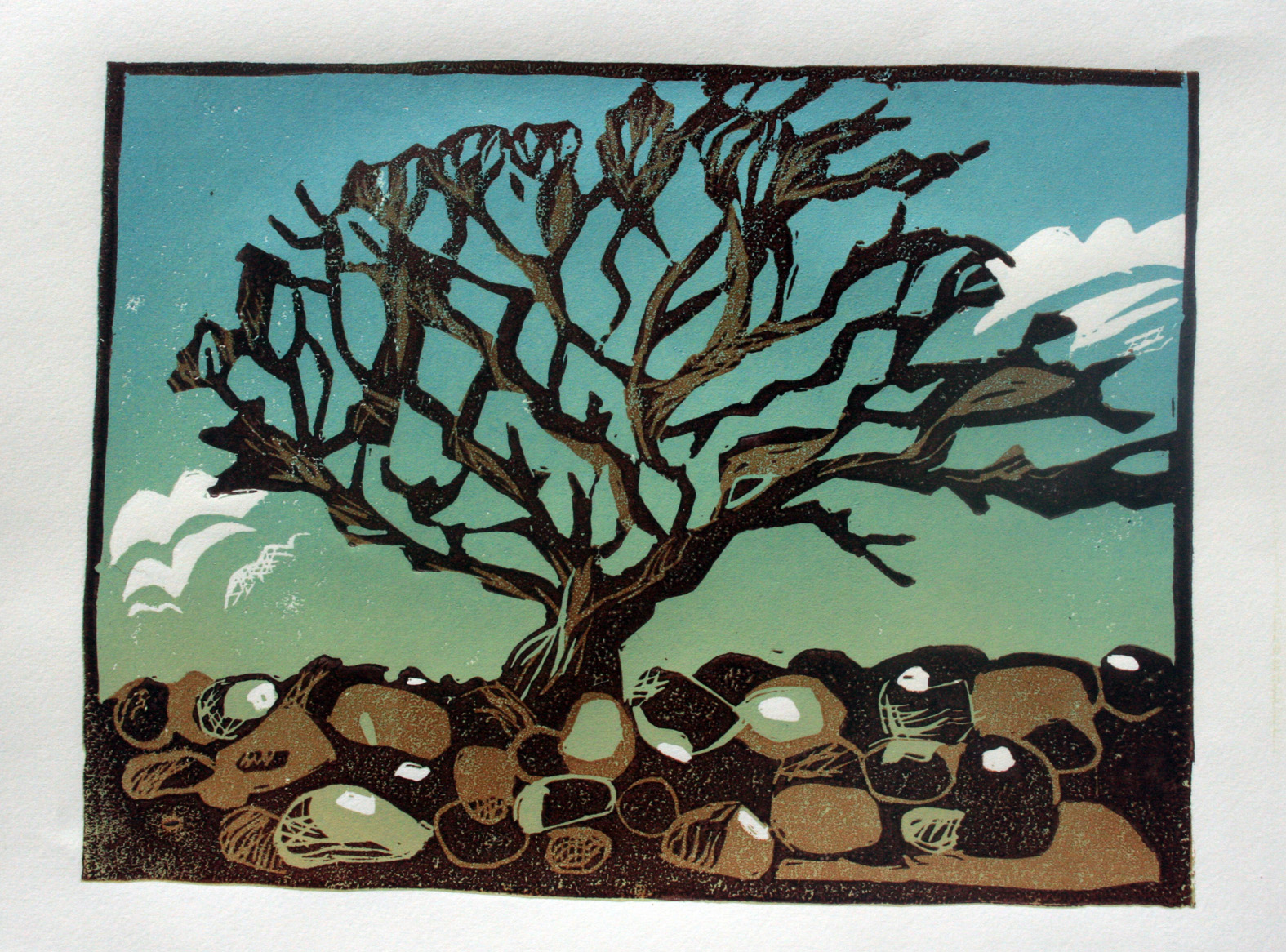
Really not sure if it worked, For the first colour layer I only printed the sky area itself rather than the entire block as I normally do. With the previous Hodomura paper, especially the later batch with the hairy surface, a rollered out edge of ink as opposed to a cut edge would result in some rather nasty lifting of the papers surface at the boundary where the ink was thinnest. This print I am using the BFK Rives 250 gsm which is a much sturdier surface and so could stand the abuse. Here is the almost finished print, just the black edging and deep shadow to apply next.


I will show the full Chough suite in series in another post, but in this post I wanted to lament the end, probably, of the registration system I have used for the last ten years. The masking tape angles.

They had a lot of advantages, easy to set up if you had to print on the kitchen table and remove at dinner time. Slightly flexible and as a new set where put down for, and to the edges of, each block it didn't matter how irregular the lino block was they would fit perfectly. A simple easy to use system that nonetheless granted me, when I got it right, perfect registration.

Disadvantages included going through a shedload of masking tape, it was a bit of a faff to cut, stretch and stick down the little bits of tape each time, if the studio got a bit too warm they could lift off losing the registration. They could not be removed, once down, until the print was finished, or I could not start a print unless I knew I had the time to complete it without needing the table for something else.

I decided to try my first multiblock/reduction print, and of course couldn't start with a little A4 test but had to go for a large complicated beach scene from Pembrokshire in A2. I toiled to cut out the key block for days and days, offset the image onto a couple more of sheets of lino, was all ready to start cutting the other blocks then had to remove the registration marks for a three day course.


"If only..", I cursed ".. I could lift the reg marks off the table and put them down again unaltered" So I looked again at a method I have seen occasionally and which was used by Anne Mytton a printmaker who came on one of my 1:1 workshops and who lugged huge registration boards for her woodcuts up and down my stairs.

A quick chat with and visit to the proper workshop of a friend of mine Mark; joiner, builder and painter,  and I have my new, and as yet untried, method of registration.


A simple sheet of MDF with another thinner strip the height of the lino, a right angle, to hold the block and wide enough to hold a smaller angle on top to register the paper.

The next print will be done using this new, to me, method and I am intrigued as to how well it may work. I also like the idea that it forces me to trim my blocks square, and that I could work on a number of different prints at the same time. The next print should be the multi/reduction I have had floating around for a while now, but it may yet be something completely different.

Long live The Registration.

Wednesday 30 November 2011

Up to date, hurrah (Happy now Sean??) NEW WEBSITE.

As mentioned in the previous post I have decided to get my Blog completely up to date by the simple method of immediately jumping forward through time to the present day and putting up the most recent event in my career calender. (Cheating I know)

I will drop in the important stuff I have chronologically overtaken as and when it arrives in the present day because there is some lovely stuff to share; a three day courses, a one to one session, a couple of new Pembrokeshire prints ( nice ) my first attempt at recovering a Baren ( Insanely and fiendishly difficult ), my first faltering steps at a multiblock/reduction print and a couple of days with the modern master of Japanese woodblock printmaking Laura Boswell who completely confounded and flummoxed me. With all that to recount you can see why I floundered in my attempt to keep up?

The main point of this first all new and gleaming up to date blog is however  to mention the launch, or relaunch, of my new and improved website:

http://www.reliefprint.co.uk/

A lot of work has been done by my partner Sian and Sean our friend to bring the site up to date, with bigger pictures, a simpler, streamlined choice of prints, links to this blog and my facebook page Reliefprint, a proper shop featuring my book, cards, new range of Giclee prints of sold out editions, links to the galleries featuring my work and information about current and forthcoming exhibitions. Have a look and let me know what you think.

As we can't leave without a picture here is a picture;

The first of my new series for my St Davids Studio Gallery exhibition next year, if there are any left by then. It is also the first of a set of three featuring the Choughs that ride the updraft along the coastal path. I will post the print stages in my next post, coming soon. (honest Sean)


No Seriously..

Lets try that again.

Answer; Here really is a really lovely picture of a tree, again, produced by Amanda Hillier. Who along with Rosey Bennet and Nga Smith (From the USA) came on my three day intensive course 10th - 12th October.

Amanda's Tree.
What I've decided to do with the backbloglog is all/none of the above. I was going to do a quick all in one go, catch up, precis. Apart from the odd thing I still want to do in more detail. Which I will drop in when, and where, the hell I like. But already in writing this and not posting it immediately I have far to much to catch up with in one go. So as I really wanted to get this particular course up on the blog, show the lovely work and talk about how lovely the guests where. ( Especially as one of the guests, Rosey, has just mailed me to ask how to find this blog. Ulp. Hi Rosey.) We will start again after this. Promise

Here is some more lovely work;

'Cherry head' By Rosey Bennet
It was a really enjoyable course, as always. As the two pictures here demonstrate there was some very striking work produced. The graduation in both pictures working really nicely. As sky in Amanda's and as background in Roseys. It really sets of the red, which we weren't sure would work that well over the top of the other blue/brown tones. This was a picture of a women with a hat full of cherries that that both Rosey and I agreed just had to be tried as a print. Having such a strong red caused some problems with colour layering. The green blue underneath in the graduation worked against the red a little bit but it works really well in the lips and for the fur collar.

A really striking print that has made me want to come back to playing with figurative and portraits. Watch out.

Thursday 10 November 2011

Post this... or this? what about THIS?

I'm sure it is a common enough problem with the blog, when things are a bit hectic out in the real world and the posts start lagging behind a bit. Result? A bit of a backbloglog, so the next time you have a couple of minutes spare you sit down to blog-up. Then realise you've got too much to catch up on in the time available. Sooo do you just do what you can now or put it off until you have enough time to do it all. Why the latter of course. Which also means by the time you sit down again even more has happened so you are even more behind. Thus needing even more time. Which is slightly more then the increased amount of time you have allocated. This time.

Question; Do you dash past a quick precis of all you have missed listing and then, up to date, deal with the most recent in more detail? Do the most recent first then keep on into the future but throw in the odd out of order past times as and when you can? Or pull your finger out, spend a bit of time catching up properly and promise never, EVER to get behind again.. Honest?

Answer: Here is a pretty picture of a tree ;

' Tree' by Amanda Hillier

Wednesday 2 November 2011

Masterclass 2.

Last month was another trip up to the Royal Cambrian Academy at Conwy for the second masterclass in Linocut and another early start. Not something I usually have to worry about, not working as Ian the Postman anymore. That's another story, a long tale of early starts, heavy bags, huge breakfasts, despair at 02.00 am, and a papercut to make a samurai wince.


The nearest I get now is either, sometimes both in a miniature tag team, of my children jumping on my head to say good morning. Even then I don't actually get up. Of course when I say early I actually mean about 07.30 which is when most working people get up anyway so I don't expect any sympathy.


There has been a good response to these courses with both fully booked and even the waiting list having a waiting list, so linocut is certainly popular. The usual interesting mix of people, ages and abilities wander in looking a bit nervous clutching an assortment of pencil cases, sketchbooks and bags although as usual there is very few men. 
The aim of the course is to get across in about six hours an understanding of the process of Reduction Linocut. Easy right? yeah dead simple.


I tend to jump straight in as time is limited, discus the materials we are to use, how to use them and then dash round the group looking at the suitability/unsuitability of the reference. Can it be turned into a linocut. Then silence descends as everyone concentrates on drawing/tracing their image onto the lino and I catch my breath for the first time since the kids jumped on my head. Another quick talk on tool use and abuse, mainly how not to cut yourself, and then it's on to cutting the white away.


With so many people and so few time I am a bit bossy and dictate that everyone is using the same colours, which makes ten people inking up a lot easier. This is when the room comes alive. After the drawing and cutting and perhaps not quite understanding how the process works. When the first print is pulled back is always a bit of an Aha moment. The trainee printer always stands dead still holds the print up and just looks at it for a moment while it all sinks in, then usually they nod. Just a tiny bit, then carry on.


We print a second colour if we have time, which means sometimes it is straight to the black to provide a nice sense of contrast with the white. Well it would if the highly trained, professional artist had actually remembered to bring the black. Eeek everyone was far to polite to comment. A dark blue it is then.
By the second colour everyone has pretty much got an understanding of the process and is buzzing with excitement. As a jaded, bitter old (ish) printer this enthusiasm and enjoyment does genuinely rekindle the enormous pleasure taken in creating an image from this simple method. I do get genuinely excited and really impatient to see what the image will look like. Lurking by a students elbow, bending over to see the image first as they peel the paper back from the block. The magic moment when you first see the new, right way round, image. 


A great aspect of linocut is just how simple the actual technique is, teachable to anyone in a couple of hours. However the depth of sophistication and variety of expression capable within that same simple method (Carve block, ink on block, paper on block, pressure. Clean block, carve some more ...) is extraordinary.


A nice bunch of people produced a nice set of interesting linocuts and every one went home happy with the quietly bubbling contentment you only get creating a small piece of yourself in the form of a small piece of artwork. Lovely.


Monday 19 September 2011

Linocut masterclass at the RCA

September the 9th and I was off to the Royal Cambrian Academy in Conwy for the first of two Linocut Masterclasses. Around 10 people turning up to be turned into expert lino-cutters in the course of a day. With lunch.


 It went very well and everyone worked very hard and came up with some lovely prints. The nice thing about these courses is that the participants come up with something completely individual, while using the same medium and colours. In many cases for the first time.


While on the course there was a very 'Isn't it a small world' moment. Turns out one of the participants was on the same degree course as me in Leicester twenty years ago and we had a good natter about the mutual friends. Wonder who will turn up at the next Masterclass at the end of this week?

Wednesday 24 August 2011

Success

Living in the wilds of Wales has lots of advantages. The calmer pace of life, the beautiful uncrowded landscape, the variety of landscape and all the great friends we have met since moving here. There is one disadvantage though which is how far away it seems from that there London.

It's not really, I can jump on a train in Mach and be in London for lunch but it seems like a long way away. So generally I look at Open competitions held at places like the Mall Galleries and think "Really should enter that" and then of course never seem to get round to it. However this year I really wanted to show at the Mall and so decided to do a picture specially. To spur me on.

I also had suitable marine sketches I wanted to do something special with as I was so pleased with them. The 'wave' sketchbook done in Scotland. I have done four A4 prints already, as test pieces, but this was the first attempt at a two colour at my usual size. 

I also discovered that I could wrap up and post my prints down to the Mall, negating my usual excuse that, well really I couldn't be bothered to travel all the way down there. No excuses left.


With some new thoughts on content, direction and styling swirling round my teeny tiny brain I purposely didn't ink this up to a definate edge but left it loose and rollerey. I did this with both colours/layers to get unplanned gaps and loose overlaps in the pattern. Still looking for ways to suggest the chaotic translucence and the dramatic movement of waves without it looking contrived or stiff.


 "Solent Flame off the Mull of Galloway. Rough. 8 knots."

Quite happy with the way it turned out. Heard at the start of this week that it was accepted which was great news and worth all the work.


Wednesday 22 June 2011

No Herons, but a couple of Ravens

After the print shenanigans of the previous attempts, I decided it must be the new batch of Hodomura paper. Solution? Try another paper, so I went back to the BFK Rives I has used on the clouds picture:


 What this paper does very well is pick up the marks from the Baren and the subtleties of the colour range in the clouds, so generally very pleased with this one. However the black is still not very saturated though a bit better. Mmmm not the paper then. Next!


Back to the Hodomura, and again I had some problems with saturation. The ink coming on pale no matter how much I loaded up the roller and the block. A real lack of flat saturated colour no matter ho much pressure I applied. With this print the layers are embossed into the paper I was applying so much pressure with the baren as the bamboo cover gradually perished and fell apart......

Right I have to eliminate potential problems. Next print different ink and paper, so it is back to the Rives which seem to work well with the Ravens and Rain picture, and another attempt with the Schmincke inks to eliminate the Graphic chemical inks as the problem. Drawing of Llyn Gwynant.


Put a lot of thought into the clouds and suggestion of the background hills fading in to the low cloud. Schmincke colours didn't quite react the same way as the Graphic chemical. Not mixing the same way or covering each other though still managed to get across the cloud rain and general damp of the walk around the lake. Still having the same issues of the inks paling out and not covering in the same saturated way I would like though it works well in the context of this print.


So not inks or paper. Ask my old Printmaking pal and general expert Gordon Miles how you clean up you rollers if they are a bit glazed and maybe not picking up enough ink! Of course he had a solution. Arriving at my studio with a jam jar containing a strong smelling solvent and a handful of fine gauge wire wool. I gave my medium roller a bit of clean and tried it on this print of Llyn Gwynant. Though I also tried another paper. A thicker 95gsm paper called Torinoko.


Roller worked much better, but now the Baren is worn through and not applying enough pressure so black still not dark and flat enough. The solution then. A twin problem. The baren has worn at the same time as the rollers were a bit greased and not picking up enough ink to transfer.

So the solution: I shall be giving the rollers a good thorough cleaning but need to sort out my Barens. Luckily I am off to visit another great printmaker who works in both wood and lino and uses the Japanese woodblock. Laura Boswell. Who, after doing a course in Japanese woodblock at the Nagasawa Art Park, has experience in recovering Barens as well as woodblock printmaking. So I am really looking forward to having a great chat about printing and Barens.

Monday 30 May 2011

Next colour for the Heron.

Back to the studio to face the first layer with the new inks that furred up the surface of my Hodomura paper.

Decided the new ink was just too much of an unknown quantity to continue with after the first layer was just so awkward. ~went back to my tried and tested Graphic Chemical water based inks for the next colour.


Here I have rolled out the graduation for the next layer..


The ink seemed to go over the top okay and the colour/tone mix works quite well, I was particularly pleased with the feel of the heron flying low over the lake. it has a nice look of space around it, like it really is floating through the air in that languid way that herons fly.


Gave me the enthusiasm to carry on. Cutting detail out of the mountain, Tryfan, and cross hatching the clouds to break up their tone.


Then to the black:


Print turned out okay but had a lot of problems with this print, even once I had swapped back to my original inks. I shall just copy in the comments from my notebook made during printing;

"Over printing the Graphic CVhemical (GC) needed to be much darker than expected to cover (The Schmincke) realised the inks absorb differently. Looks like the GC is beinbg absorbed through the Schmincke (S) resulting in a ridge as the compression of printing pushes the second layer of inbk through the first.

Black ink, GC, not going on very well. Almost impossible to get the dark saturated colour I use the black for. Some signs of paper damage also. is it because it is going over the original layer of S? Or has the S ink damaged the surface of the paper?

None of the colours have been particularly flat or saturated.

Almost over inking the block to get sufficient coverage, but then almost pulling the paper surface off when pull the print.  Have to pull the paper incredibly slowly and gingerly to avoid damage"

Same inks I always use, same rollers and same paper. Except it is a brand new batch. Slightly different Hodomura paper causing the problem? Starting to get paranoid and obsessively stroking the surface of the paper to feel if it has a different texture to previous Hodomura.

Tune in next time to read the thrilling solution to the mystery of "When prints go bad"


Tuesday 17 May 2011

More lakes - With Heron!

I have already done a picture of Llyn Idwal, the one with the curse that prevented any bird flying across its dark waters and the heron that was oblivious to that curse. However the previous image was a woodcut and I wanted to have another go at that scene with lino but not do a straight repeat. Luckily I had another view of Llyn Idwal from a slightly different angle as I followed the Heron across the lake in my sketches.


Again wasn't really sure where I was going with this so did a bit more colouring in of the tracing to get more of a feel for the contrast, chiaroscuro etc..


From this colouring I realised it was important to keep the depth of view between the foreground rock, lake, the moraine at the head of the lake, and looming above Tryfan. So the rock had to be pale and the mass of Tryfan quite dark but with some detailing. I really couldn't decide what colour to do the lake so left it blank to be 'filled in later'. But then sitting across the studio and staring at the drawing for a while (Important part of an artists practice, staring) it came to me that it needed to be very pale and flat. 

For this print I decided to experiment with a new set of inks I had bought as I was unable to get hold of a yellow in the inks I currently use. Problems at the manufacturing end apparently and as all these water soluble inks are not cross compatible I had to buy a complete new set in which included a yellow. I went for a Schmincke set of inks as the colours looked good and another very fine linocut artist I know call Robert Gilmor uses them, with stunning results.

Their consistency is much more liquid and thinner than my previous inks and it seemed harder to get a good graduated mix without it almost seeming too runny and the roller skidding over the ink. Once on the block that thinness meant the ink didn't seem to cover very well. Almost as if was drying as I applied it. The first print seemed okay until I tried to peel the paper of the block, where it felt as if the ink had dried as I was printing and the paper was almost stuck to the lino! It took very careful peeling to remove the paper without leaving half of it behind.

 Too much pressure? not enough ink? too much white ink? I kept going but had to re-mix more ink for each image, so seemed to be using a lot more than usual but then it looked as if there was not enough ink on the paper once I had printed. The colour, what there was of it, was really nice on the paper, it held a very accurate edge on even the finest cutting but just seemed too thin. Oh and of course nearly took the paper apart getting it off. Wrong paper?


Looks okay though. Some nice elements where the ink is so thin it shows the baren marks, which I always like. Bit dispirited by the whole thing really so I left it at that and went home...

Most excellent exhibition

I was lucky enough to have received an invitation to the Clive Hicks-Jenkins retrospective which opened at the National Library of Wales last Saturday, the 7th, and it was fantastic. Such a wide breadth of expressive, contemplative, beautiful paintings. They were introduced as if the gallery had become a church and indeed while being completely modern the paintings felt as if they belonged on a medieval alter.

Have a look at Clive's website and if you are within a 100 miles of Aberystwyth and the National Library and you get the chance do visit.

http://www.hicks-jenkins.com/

Wednesday 4 May 2011

Back to the Llynoedd (Lakes)


I was very pleased with this sketch from the shore of Llyn Ogwen ( The image above is the A2 tracing done from the original drawing). It is my first A3 sized sketch rather than the more usual A4 and done with a drawing felt pen rather than my usual pencil. After drawing the scene in my normal A5 sketchbook it looked cramped and squished in. So I drew it again in my bigger sketchbook I had taken along for just such an eventuality. The landscape around the foothills of Snowdon being so expansive.

However once ready to print I realised that I didn't really know where I was going with it. Being determined to 'do something special' can be quite inhibiting. There was a vague feeling that I wanted to do something to follow on from and develop further the previous A4 two colour wave prints. But how?

To make matters worse I had decided to experiment with a completely new non Japanese paper. No pressure than. 

The paper is BFK Rives which is a lovely strong, bright white, four deckled edges paper but with a slightly rough surface. After printing the first print of the first colour I realised the surface was just a bit to rough to get a good smooth take up of ink printing by hand. So I turned it over and printed on the back. Has a slight laid pattern on the reverse which does add to the print.

It was only when I coloured in the tracing, and was quite strict in keeping to only two colours and black that I started to get somewhere. It also had to be quite bold colours, almost a pure yellow/ yellow ochre and a strong slate blue!


I also wanted to keep it as rough and loose as the original sketch with very strong cutting and patterns so kept more to the original drawing. Without the usual additional colours to help distinguish different areas in this print I decided to use more expressive cutting and really enjoyed getting a bit carried away. I also haven't used black for the final colour for a while now, finding it too heavy and dark against the lighter palette of colours I have been using. In this instance though it had to be black to get the most out of the contrast and the hopefully expressive cutting.


The paper worked very well and has taken the colour and the most delicate lines well. There is a slight misting or graininess to the black where it is not the completely saturated colour you expect. That may be down to the paper simply being a bit to thick to hand print, or to the plate getting a bit greasy while cutting because the intricacy of the drawing results in more chinagraph pencil being on the lino. As you cut the wax of the chinagraph line is rubbed across the plate creating a slight resist to the water based inks?
Very happy with the print and the overlay of colour, pattern and cutting. Just not sure how it fits in with the other prints. Next:


Wednesday 27 April 2011

Ahoy. Ahah

I've always loved the tang of the sea air and fancied myself as a bit of a salty sea dog, without really going to sea that much. Though I have always enjoyed the little sailing I have managed. So when my dad invited me along on one of his sailing trips with the old boys I hesitantly jumped at the chance. A week cooped up in a tiny boat with my dad and two complete strangers in the midst of the Irish Sea with some of the most unpredictable weather in the world, what could go wrong?

Well surprisingly nothing really. Apart from a touch of going green for the first day, due to the weather being so rough, it was a good trip. We sailed from Whitehaven to Portpatrick and once I had my sea legs it was really enjoyable to sit on the pitching back deck, sketchbook clutched in hand drawing.  Trying to catch the coast sliding past at a rate of about 7 - 8 knots and the constant swell and shift of the waves passing underneath lifting then dropping the boat and roaring away towards the shore.  


Normally a 'Coastal' landscape involves a walk along the coast looking down or out to sea, seeing the front of a wave breaking and crashing landward. It was a novel and exciting challenge to be out at sea looking in to shore and watching the back of the wave moving away from me against the back drop of the land.

I think some of the sketches I produced over a couple of days rank up there with the best I have ever produced. In terms of their natural drama, composition and potential to be great prints. I'm really keen to continue the draw from the sea method, just perhaps not by sail. Sea Kayak maybe?

So when Aberystwyth Printmakers called for work for two new shows, both to consist of A4 sized prints there was only one set of sketches I reached for. One of the shows is at Aberystwyth Arts Centre opening the 8th of May, the other was at Wharapuke in New Zealand.

This print is of the Little Ross lighthouse, on the entrance to Kirkcudbright Bay, being left astern as we raced away.


Usually I enlarge my sketches from A4 up to A2 size but I finally thought I would have a go at doing the print the same size as the sketch. I only used a couple of colours and black and when I inked up purposefully kept the inking loose and quite random. Making sure not to cover the entire printing area. This keeps the print loose and spontaneous and is in keeping with the sketch and subject matter. It also adds a certain feeling of thinness and translucence which helps give the waves depth. With this print I also tried an all brown version.


This is Little Ross lighthouse earlier as we left Kirkcudbright Bay and turned to travel along the coast


Very happy with how these turned out at A4, so the next thing is to try them at the usual A2 size and perhaps even larger.

But first.....


Back to the lakes of Snowdonia and a different paper!

Monday 28 February 2011

Torres Strait islander Alick Tipoti

Kid's in bed, cup of tea brewed, settled down to watch something on the iplayer and the Griff Rhys Jones new series 'Hidden Treasures of... Australian Art ' catches the eye. Always a sucker for the intensity and originality of spiritual art but wasn't sure if Griff was the man to deliver it.

So imagine my surprise when about 6 minutes in the first artist he visits in his search for the maker of a tribal mask is Alick Tipoti, a Torres Strait Islander now living in Cairns. Who while also carving masks usually works in .... fanfare.. Linocut. Huge bloody great things, in black and white, dense with fascinating pattern and incredibly rich in meaning and belief.

Here is an explanation of his work;

"Alick Tipoti is a Torres Strait Islander who is guided by the traditional cultural practices of his people. He believes in the Zugubal who were spoken about for many years by his ancestors. He is most diligent about what he sees as his responsibility to document the stories, genealogies, songs and other aspects of his culture so that it is available for future generations to learn, understand and practice. He speaks his native language, Kala Lagaw Ya of the Maluilgal nation of Zenadh Kes. Alick believes that language is the vital ingredient that binds all cultures in the world today. ‘Without your language you become a foreigner, lost in another persons culture. * The Australian Art Print Network "


'Koedalal ar Sapural'


Kuyku Garpathamai Mabaig 2007
linocut on paper, edition 3/45

And just to give you an indication of the size and impact of the prints heres the man himself with his wonderful pictures.


 A great deal of his philosophy regarding the place of language in defining and grounding a culture has many parallels with the place and importance of the Welsh language in shaping the resurgence of the welsh culture and nation today. There is also a very interesting piece in the programme where he talks of the spirits of his ancestors helping him with the print, although not as strongly in Cairns as they do back home. To help them with this he usually prints at night. A lot of artist talk of the Muse but his is much more personal and effective it seems. I was fascinated to see how his immersion, his belief in his traditional belief system gives him an unshakable confidence and self belief in his own work and his place, both historical and cultural, in producing that artwork. Which gives his artwork not only a vast wealth of subject to draw upon but a passion and integrity in the execution of that subject, that has such meaning for him, and which then goes a long way towards giving the work it's power.

If as a modern western artist you have no religion, no organised beliefs, where does that passion, that belief in the point and meaning of your own work come from. Do you need it at all? Or do you have to scrabble around and find something else to believe in, spiritual or not to replace the lack of a coherent system in which you have a place. Can you create your own things to believe in and find important enough to give your work  a sense of depth and veracity? Or can you ( can I ) draw on the religious, historical and cultural baggage into which I was born without the belief in that baggage.

Really loved the idea, especially after the shots of the Torres Islands Landscape, of an Artist as different from me as can be in terms of location, climate, culture, language, geography and especially belief, but still using lino, a language we could both speak.

Will have a big think on this and see where it takes me. Back to St George and the Dragon I think.

Tuesday 22 February 2011

Number two, The Misty Mountain (Not Tolkien!)

The second smaller illustration for the i-ching was to be a mountain path ascending up through the mists. As luck would have it I found a great sketch I had done, but not yet used, of Tryfan. A great grey shattered peak of a mountain in North Wales. It rears like a broaching whale above Llyn Ogwen and I had sketched it from below the main road and included the bridge so with a bit of judicious photoshoppery majigerry, Tryfan was stretched up to mountain of heaven proportions, I then redrew the bridge to make it a bit more 'Chinese' and put a winding path in and then 'bigged'up the river that runs under the bridge. The actual river Ogwen is concealed by the cut it runs in but I wanted a rushing mountain stream so lifted it right up and made it foam and splash. It was also a good way to take the eye into the composition and accentuate the path/steps by separating them out from the main body of the picture.


Initially the path started with steps just in the immediate foreground with the idea that you went out of the picture and back in again at the bridge to suggest the winding nature of the path.  The client then decided they wanted it a bit more obvious that the steps in the foreground connected directly to the bridge and up the mountain.
Rough 2:


 Steps wind up to the bridge and the cliff on the edge has gone. This does have the added bonus of making the main mountain seem higher. Mmmm steps a bit too erm steppy and maybe too easy! How about more of a rough path to suggest the hard and worthy work involved. Mmmm what about that bridge? Too bridgey maybe? Maybe it should be more of a rough mountain track all au natural. yes lose the bridge!
Rough 3:


Path rough and stoney, bridge, one of my favourite bits, transformed cunningly into a natural arch and the difficult path switch backing up the mountain accentuated. That's it, perfect!
Artwork:


This was a two colour print, with a graduation in the layers to add more variety and depth.  I do like the background mountains emerging from the mist in a paler colour. Was a nice chance to experiment with rubbing out part of the ink to knock that part of the print back and also try the cutting of the mountain sides in lines to suggest the form. Overall a happy client.


Saturday 5 February 2011

Intermission - A little illustration job

My agent in London NB illustration passed on a nice little illustration job to me recently doing a pitch for a book publisher to take to the Frankfurt Book Fair. The book is a new fully illustrated edition of the I-Ching for which I was asked to do two sample illustrations for page mock ups.  The first half page full colour picture is of a chinese junk, the second a typical misty Chinese mountain with ascending path.


The first sketch I sent (Above) had all the elements , but not enough vavavoom. Not oriental enough, so I spiced it up with more than a hint of eastern promise, sent it off and it was a hit. (Below)


The Junk needed a bit of work as it currently looks like a bathtub, which I corrected for in the print sketch. 


Final print. As you can no doubt see the main inspiration for the waves was good 'ole Hokusai's 'Great Wave' and other wave images from his 100 views of Mount Fuji. Although I put a lot of effort into the various sections and shades of blue in the foreground waves. Really wanted to get a sense of depth and distance in, with the feel that the sea was choppy all the way to the horizon. Really pleased with the way it turned out, more so now that I can see it fresh, not having looked at it for a couple of months.

Next post: The misty mountain...


Monday 24 January 2011

Second lake - First woodcut

After an agonising and frustrating wait of years and years I have finally got down and got on with doing my first 'proper' landscape woodcut. The wood is a Japanese plywood that I have had for a while and used for numerous things other than printing from. The image is the second of the Snowdonia lake series. This time the small lake, Llyn Idwal, reached by following the footpath from behind the youth hostel at the head of  Llyn Ogwen.

The name comes from the legend of Idwal son of Owain Prince of Gwynedd.  He was brutally murdered by being drowned in the lake and as a result of this crime, the lake has a desolate air and no birds will fly over the water. While sitting and drawing I took great care to watch for any feathered creature hurling itself, in defiance of the legend, across the lake. I saw many small birds turning back at the waters edge and although initially sceptical I was starting to almost believe there might be something in the legend. ( Like walkers around Loch Ness, keeping an eye out for Nessie, while knowing it is all nonsense and yet dying to be proved wrong)

Then a Heron, wings flapping slow and heavy with dignity, made it's ponderous way down the length of Llyn Idwal with not a thought for the legends it flew through or that it became the star of my sketch.


Here I have printed the first base colour and am now cutting it out. I am trying a new set of basic Japanese cutting tools, which until I started cutting wood, I hadn't worked out what a couple of the straight bladed tools are for. The main difference between lino and wood  is that wood 'runs on' along the grain, where as you can flick out a piece of lino at the end of the cut to finish neatly in a straight edge, with wood if you are cutting along the grain it doesn't finish neatly it rips on along the grain. So you get the straight bladed tool and cut where you want the particular mark to finish.

This means the cutting takes a lot, LOT longer. All the loose flicking cutting possible with a lino where you cut, flick out the unwanted lino and keep going dies a death with a woodcut. It is, has to be more deliberate and considered. it's cut, mark edge, cut, edge, cut. Though the harder grained wood is capable of holding finer marks than lino as long as the tools are sharp enough. You can also cut a bit loose if you gouge and then as you are cutting lift the v-tool up and out in the same movement. This can give nice fluid strokes which I used at the end for the pattern on the grass.


Detail of the famous myth busting heron. With sharp enough tools and enough patience you can get quite fine detail.


The block inked up with the third colour. The main difference with the wood was the way it absorbed my water based inks. Obvious really with hindsight. I should have sealed the wood with a size or PVA first. It meant I had to considerably over ink the block to get any kind of saturation of colour on the print, and apply much more pressure than usual to transfer that ink over. Which meant that any delicate detail I had painstakingly cut became crude due to the heaviness of the ink and pressure.


Peeling of the third colour. Seeing the mirror image, which looks like the complete base of a hill, makes me want to do a much bigger print of something more monumental and show its complete form rather than chipping away at the edges.


 Third colour applied, a chocolate brown. While drawing the water in the lake had looked a rich brown to me and I wanted that in the print.


Last colour applied and as usual it seems to change the whole balance of the print.  I deliberately chose a similar sketch and composition, along with colours to the previous Llyn Ogwen print as I wanted the wood to be the main difference and see what a difference it made. 
The difference? Other than the more deliberate technique needed in cutting and the change in inking up it felt, paradoxically for a harder and more durable material, to be softer and more subtle in effect than lino. Fine detail suffered due to the over inking/absorbtion issue, which meant I wasn't completely happy with the subtlety of the colour range but they are issues of my inexperience with plywood rather than intrinsic qualities of the medium. The hills did seem larger, and as previously, mentioned more 'monumental' than the Llyn Ogwen lino which I liked.
I got a strange (well perhaps not that strange) urge to try and arrange a trip out to New Mexico and monument valley to attempt the sculptural landscape out there.

I will 'wood up' again but it will need a different bigger and bolder subject matter and work will have to be done on the ink absorbtion issue. Oil based inks??

This looking for the monumental will lead my eye on my next drawing trip to Snowdonia, while the next print will be back to lino. Perhaps only 2 colour with more cutting, perhaps finally a multi-block print!