Wednesday, 30 November 2011

No Seriously..

Lets try that again.

Answer; Here really is a really lovely picture of a tree, again, produced by Amanda Hillier. Who along with Rosey Bennet and Nga Smith (From the USA) came on my three day intensive course 10th - 12th October.

Amanda's Tree.
What I've decided to do with the backbloglog is all/none of the above. I was going to do a quick all in one go, catch up, precis. Apart from the odd thing I still want to do in more detail. Which I will drop in when, and where, the hell I like. But already in writing this and not posting it immediately I have far to much to catch up with in one go. So as I really wanted to get this particular course up on the blog, show the lovely work and talk about how lovely the guests where. ( Especially as one of the guests, Rosey, has just mailed me to ask how to find this blog. Ulp. Hi Rosey.) We will start again after this. Promise

Here is some more lovely work;

'Cherry head' By Rosey Bennet
It was a really enjoyable course, as always. As the two pictures here demonstrate there was some very striking work produced. The graduation in both pictures working really nicely. As sky in Amanda's and as background in Roseys. It really sets of the red, which we weren't sure would work that well over the top of the other blue/brown tones. This was a picture of a women with a hat full of cherries that that both Rosey and I agreed just had to be tried as a print. Having such a strong red caused some problems with colour layering. The green blue underneath in the graduation worked against the red a little bit but it works really well in the lips and for the fur collar.

A really striking print that has made me want to come back to playing with figurative and portraits. Watch out.

Thursday, 10 November 2011

Post this... or this? what about THIS?

I'm sure it is a common enough problem with the blog, when things are a bit hectic out in the real world and the posts start lagging behind a bit. Result? A bit of a backbloglog, so the next time you have a couple of minutes spare you sit down to blog-up. Then realise you've got too much to catch up on in the time available. Sooo do you just do what you can now or put it off until you have enough time to do it all. Why the latter of course. Which also means by the time you sit down again even more has happened so you are even more behind. Thus needing even more time. Which is slightly more then the increased amount of time you have allocated. This time.

Question; Do you dash past a quick precis of all you have missed listing and then, up to date, deal with the most recent in more detail? Do the most recent first then keep on into the future but throw in the odd out of order past times as and when you can? Or pull your finger out, spend a bit of time catching up properly and promise never, EVER to get behind again.. Honest?

Answer: Here is a pretty picture of a tree ;

' Tree' by Amanda Hillier

Wednesday, 2 November 2011

Masterclass 2.

Last month was another trip up to the Royal Cambrian Academy at Conwy for the second masterclass in Linocut and another early start. Not something I usually have to worry about, not working as Ian the Postman anymore. That's another story, a long tale of early starts, heavy bags, huge breakfasts, despair at 02.00 am, and a papercut to make a samurai wince.


The nearest I get now is either, sometimes both in a miniature tag team, of my children jumping on my head to say good morning. Even then I don't actually get up. Of course when I say early I actually mean about 07.30 which is when most working people get up anyway so I don't expect any sympathy.


There has been a good response to these courses with both fully booked and even the waiting list having a waiting list, so linocut is certainly popular. The usual interesting mix of people, ages and abilities wander in looking a bit nervous clutching an assortment of pencil cases, sketchbooks and bags although as usual there is very few men. 
The aim of the course is to get across in about six hours an understanding of the process of Reduction Linocut. Easy right? yeah dead simple.


I tend to jump straight in as time is limited, discus the materials we are to use, how to use them and then dash round the group looking at the suitability/unsuitability of the reference. Can it be turned into a linocut. Then silence descends as everyone concentrates on drawing/tracing their image onto the lino and I catch my breath for the first time since the kids jumped on my head. Another quick talk on tool use and abuse, mainly how not to cut yourself, and then it's on to cutting the white away.


With so many people and so few time I am a bit bossy and dictate that everyone is using the same colours, which makes ten people inking up a lot easier. This is when the room comes alive. After the drawing and cutting and perhaps not quite understanding how the process works. When the first print is pulled back is always a bit of an Aha moment. The trainee printer always stands dead still holds the print up and just looks at it for a moment while it all sinks in, then usually they nod. Just a tiny bit, then carry on.


We print a second colour if we have time, which means sometimes it is straight to the black to provide a nice sense of contrast with the white. Well it would if the highly trained, professional artist had actually remembered to bring the black. Eeek everyone was far to polite to comment. A dark blue it is then.
By the second colour everyone has pretty much got an understanding of the process and is buzzing with excitement. As a jaded, bitter old (ish) printer this enthusiasm and enjoyment does genuinely rekindle the enormous pleasure taken in creating an image from this simple method. I do get genuinely excited and really impatient to see what the image will look like. Lurking by a students elbow, bending over to see the image first as they peel the paper back from the block. The magic moment when you first see the new, right way round, image. 


A great aspect of linocut is just how simple the actual technique is, teachable to anyone in a couple of hours. However the depth of sophistication and variety of expression capable within that same simple method (Carve block, ink on block, paper on block, pressure. Clean block, carve some more ...) is extraordinary.


A nice bunch of people produced a nice set of interesting linocuts and every one went home happy with the quietly bubbling contentment you only get creating a small piece of yourself in the form of a small piece of artwork. Lovely.


Monday, 19 September 2011

Linocut masterclass at the RCA

September the 9th and I was off to the Royal Cambrian Academy in Conwy for the first of two Linocut Masterclasses. Around 10 people turning up to be turned into expert lino-cutters in the course of a day. With lunch.


 It went very well and everyone worked very hard and came up with some lovely prints. The nice thing about these courses is that the participants come up with something completely individual, while using the same medium and colours. In many cases for the first time.


While on the course there was a very 'Isn't it a small world' moment. Turns out one of the participants was on the same degree course as me in Leicester twenty years ago and we had a good natter about the mutual friends. Wonder who will turn up at the next Masterclass at the end of this week?

Wednesday, 24 August 2011

Success

Living in the wilds of Wales has lots of advantages. The calmer pace of life, the beautiful uncrowded landscape, the variety of landscape and all the great friends we have met since moving here. There is one disadvantage though which is how far away it seems from that there London.

It's not really, I can jump on a train in Mach and be in London for lunch but it seems like a long way away. So generally I look at Open competitions held at places like the Mall Galleries and think "Really should enter that" and then of course never seem to get round to it. However this year I really wanted to show at the Mall and so decided to do a picture specially. To spur me on.

I also had suitable marine sketches I wanted to do something special with as I was so pleased with them. The 'wave' sketchbook done in Scotland. I have done four A4 prints already, as test pieces, but this was the first attempt at a two colour at my usual size. 

I also discovered that I could wrap up and post my prints down to the Mall, negating my usual excuse that, well really I couldn't be bothered to travel all the way down there. No excuses left.


With some new thoughts on content, direction and styling swirling round my teeny tiny brain I purposely didn't ink this up to a definate edge but left it loose and rollerey. I did this with both colours/layers to get unplanned gaps and loose overlaps in the pattern. Still looking for ways to suggest the chaotic translucence and the dramatic movement of waves without it looking contrived or stiff.


 "Solent Flame off the Mull of Galloway. Rough. 8 knots."

Quite happy with the way it turned out. Heard at the start of this week that it was accepted which was great news and worth all the work.


Wednesday, 22 June 2011

No Herons, but a couple of Ravens

After the print shenanigans of the previous attempts, I decided it must be the new batch of Hodomura paper. Solution? Try another paper, so I went back to the BFK Rives I has used on the clouds picture:


 What this paper does very well is pick up the marks from the Baren and the subtleties of the colour range in the clouds, so generally very pleased with this one. However the black is still not very saturated though a bit better. Mmmm not the paper then. Next!


Back to the Hodomura, and again I had some problems with saturation. The ink coming on pale no matter how much I loaded up the roller and the block. A real lack of flat saturated colour no matter ho much pressure I applied. With this print the layers are embossed into the paper I was applying so much pressure with the baren as the bamboo cover gradually perished and fell apart......

Right I have to eliminate potential problems. Next print different ink and paper, so it is back to the Rives which seem to work well with the Ravens and Rain picture, and another attempt with the Schmincke inks to eliminate the Graphic chemical inks as the problem. Drawing of Llyn Gwynant.


Put a lot of thought into the clouds and suggestion of the background hills fading in to the low cloud. Schmincke colours didn't quite react the same way as the Graphic chemical. Not mixing the same way or covering each other though still managed to get across the cloud rain and general damp of the walk around the lake. Still having the same issues of the inks paling out and not covering in the same saturated way I would like though it works well in the context of this print.


So not inks or paper. Ask my old Printmaking pal and general expert Gordon Miles how you clean up you rollers if they are a bit glazed and maybe not picking up enough ink! Of course he had a solution. Arriving at my studio with a jam jar containing a strong smelling solvent and a handful of fine gauge wire wool. I gave my medium roller a bit of clean and tried it on this print of Llyn Gwynant. Though I also tried another paper. A thicker 95gsm paper called Torinoko.


Roller worked much better, but now the Baren is worn through and not applying enough pressure so black still not dark and flat enough. The solution then. A twin problem. The baren has worn at the same time as the rollers were a bit greased and not picking up enough ink to transfer.

So the solution: I shall be giving the rollers a good thorough cleaning but need to sort out my Barens. Luckily I am off to visit another great printmaker who works in both wood and lino and uses the Japanese woodblock. Laura Boswell. Who, after doing a course in Japanese woodblock at the Nagasawa Art Park, has experience in recovering Barens as well as woodblock printmaking. So I am really looking forward to having a great chat about printing and Barens.

Monday, 30 May 2011

Next colour for the Heron.

Back to the studio to face the first layer with the new inks that furred up the surface of my Hodomura paper.

Decided the new ink was just too much of an unknown quantity to continue with after the first layer was just so awkward. ~went back to my tried and tested Graphic Chemical water based inks for the next colour.


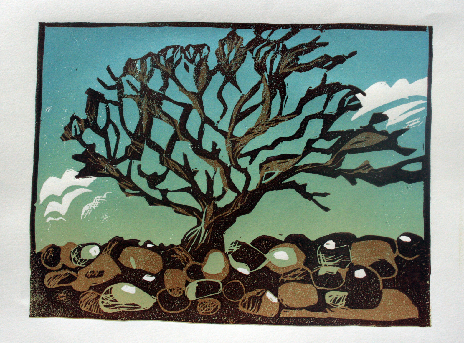
Here I have rolled out the graduation for the next layer..


The ink seemed to go over the top okay and the colour/tone mix works quite well, I was particularly pleased with the feel of the heron flying low over the lake. it has a nice look of space around it, like it really is floating through the air in that languid way that herons fly.


Gave me the enthusiasm to carry on. Cutting detail out of the mountain, Tryfan, and cross hatching the clouds to break up their tone.


Then to the black:


Print turned out okay but had a lot of problems with this print, even once I had swapped back to my original inks. I shall just copy in the comments from my notebook made during printing;

"Over printing the Graphic CVhemical (GC) needed to be much darker than expected to cover (The Schmincke) realised the inks absorb differently. Looks like the GC is beinbg absorbed through the Schmincke (S) resulting in a ridge as the compression of printing pushes the second layer of inbk through the first.

Black ink, GC, not going on very well. Almost impossible to get the dark saturated colour I use the black for. Some signs of paper damage also. is it because it is going over the original layer of S? Or has the S ink damaged the surface of the paper?

None of the colours have been particularly flat or saturated.

Almost over inking the block to get sufficient coverage, but then almost pulling the paper surface off when pull the print.  Have to pull the paper incredibly slowly and gingerly to avoid damage"

Same inks I always use, same rollers and same paper. Except it is a brand new batch. Slightly different Hodomura paper causing the problem? Starting to get paranoid and obsessively stroking the surface of the paper to feel if it has a different texture to previous Hodomura.

Tune in next time to read the thrilling solution to the mystery of "When prints go bad"